How to Develop Your Personal Brand as a Design Student

Developing a personal brand and aesthetic is one of the most important parts of presenting yourself as a design student. Personal branding can include anything from fonts and color schemes to your own personal logos, icons and style. These choices all communicate who you are as a designer to your professors, potential employers, and any other connections. The idea of creating a brand for yourself can seem abstract and confusing, so I have included some ways to make these types of decisions below:


Research the branding of other designers, companies, and brands that inspire you.

Although you don’t want to copy the ideas of anyone else, looking at the work of others can help you figure out what elements you like and dislike. Comparing some of the designers you admire will also show you what type of designer you are yourself. Notice what types of features and aesthetics attract you in others’ works and keep them in mind when producing your own branding. 


Take the time to look through all of the work that you have produced and find the similarities.

Sometimes it’s hard to see a common thread in your designs when you focus on each individual project so intensely. Looking over all of your projects at once may show you new things about yourself and steer the direction that your personal branding may take. 


Decide what type of message and emotion you want to convey to your audience.

Looking at both the work of other designers you like and at your own helps you decide who you are and how you want to present yourself creatively to others. Thinking of a specific feeling you want to evoke is a good way to make sure that your branding choices stay on track. 


Explore different layouts and color scheme combinations that already exist.

Once you have a good idea of what your aesthetic is, looking at existing layout templates makes it easier to narrow down which types align with your values as a designer. Take note of the types of designs that you like and think about how you can combine them in a unique and personal way. Compare various fonts and colors to determine which ones accurately depict your message.


Decide whether you want to create your own logo. 

If you choose to make your own logo, use what you learned throughout your personal branding experience to make sure it is consistent with the rest of your design choices. Using similar colors and compatible fonts will help keep your final product cohesive. Logos also shouldn’t be too overpowering or distracting because they are usually not the main focus of your resume, cover letter, website, and/or portfolio. However, something small and relatively simple can elevate your work.

How do I format my resume?

Have you ever seen a horizontal line on one of those resume templates and could never figure out how to make it? The College of Human Ecology Career Explorations Center has got you covered with these general tips and tricks to make your resume look professional!

white printer paper beside silver laptop computer
photo credits to Markus Winkler

Overview of Tips:

  1. General Recommendations
  2. How to adjust margins
  3. How to insert a horizontal line
  4. How to insert an M-Dash vs. N-Dash
  5. How to insert bullets (intraline • bullets) and vertical lines | between words
  6. How to indent/tab right or left
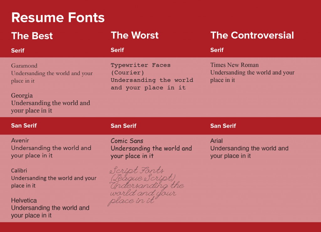
  7. Recommended Fonts

General Recommendations:

  • Your margins cannot be smaller than 0.5 inches
  • Your font size cannot be smaller than 10.5 pt.
  • Your name should be the largest sized text on your resume.
  • Always include dates in reverse chronological order with the months spelled out and aligned.
    • If you are still in that position, it should be listed before experiences you have already completed.
  • You should have 2-4 bullets for each experience’s description.

How to adjust margins:

Word

  1. Select “Layout” on the overhead bar.
  2. Find “Margins” and select an option from the drop down menu.
    • To have your margins at 0.5 in, select “Narrow”
    • To adjust margins manually, select “Custom Margins” and input dimensions.

Google Docs

  1. Select “File” on the overhead bar.
  2. Find “Page Setup” on the drop down menu.
  3. Adjust the margins as needed.

How to insert a horizontal line:

Word

  1. From “Home” find and select the borders icon and from the drop down menu select “Horizontal Line”
  2. If you wish to further edit the line to your liking, you can click the horizontal line you’ve made and select “Format Shape.” You should be able to change the line weight or color.

Google Docs

  1. On the overhead bar find “Insert.”
  2. On the drop down menu, select “Horizontal Line”

How to insert an M-Dash vs an N-Dash

When to use each one: The n-dash is used for number ranges, dates, or distances while the m-dash is used to separate a dependent clause or a final part of a sentence that does not completely flow with the rest of the sentence. An m-dash is longer than an n-dash.

Word

N-dash (-):

  1. Find “Insert”, and on the drop down menu select “Symbol.”
  2. Then select “Advanced Symbol.” It will be the 14th character in the first row

M-dash (—):

  1. Find “Insert”, and on the drop down menu select “Symbol.”
  2. Then select “Advanced Symbol.” It will be the 14th character in the first row
  3. You can also press Shift + Option + “-” key and it will

Google Docs

N-dash (-):

  1. Find “Insert”, and on the drop down menu select “Special Characters”
  2. Search “dash” and then select the second option (hover over this icon to confirm that it states “EN DASH”)

M-dash (—):

  1. Find “Insert”, and on the drop down menu select “Special Characters”
  2. Search “dash” and then select the third option (hover over this icon to confirm that it states “EM DASH”)
  3. You can also press Shift + Option + “-” key and it will create an M-dash

How to insert bullets (intraline • bullets) and vertical lines | between words:

Word

Bullets:

  1. Find “Insert”, and on the drop down menu select “Symbol.”
  2. Then select “Advanced Symbol.” It will be the 12th character in the sixth row

Vertical Lines:

  1. Find “Insert”, and on the drop down menu select “Symbol.”
  2. Then select “Advanced Symbol.” It will be the 9th character in the first row
  3. You can also press Shift + “|” key (above Enter)

Google Docs

Bullets:

  1. Find “Insert”, and on the drop down menu select “Special Characters”
  2. Search “bullet” and then select the first option (hover over this icon to confirm that it states “BULLET”)

Vertical Lines:

  1. Find “Insert”, and on the drop down menu select “Special Characters”
  2. Search “vertical line” and then select the fifth option (hover over this icon to confirm that it states “VERTICAL LINE”)
  3. You can also press Shift + “|” key (above Enter)

How to indent/tab right or left

Word

  1. Find “View” on the overhead bar and check the “Ruler” icon
    • Make sure that the arrow icon on the left side of the ruler is pointing towards the left
  2. Once the arrow appears on the right side of the ruler, drag the arrow to the right side to align with the shaded region
  3. Type out the sentence you wish to have on the left side, then hit Tab on your keyboard and the cursor should jump to the right side so you can continue

Google Docs

  1. Find “View” and make sure that you have “Show Ruler” checked
  2. On the ruler, click where you want the right-most character of the right-aligned section to be. Then select the option that pops up: “Add right tab-stop”
  3. On that line, type your left-most text as normal, then hit the Tab key until your cursor is located at the tab-stop you just created, then type your text. You should notice that it fills in from the right.
  1. Times New Roman
  2. Garamond
  3. Helvetica
  4. Georgia
  5. Cambria

Dear Aunt Martha: Cover Letter Help!

cover letter illustration

Dear Aunt Martha,

Help! Cover letters for summer internships are a struggle. How do I sound professional without being boring?!

Sincerely,

Anxious Applicant

(more…)

“Digital or Print?” and Other Design Portfolio Questions


portfolioA designer’s journey in securing a job or internship isn’t complete without a design portfolio. A portfolio is an organized collection of work that demonstrates a designer’s skills, abilities, and interests, and is an integral part of providing evidence of that designer’s competence. Portfolios come in all sorts of shapes and sizes, and vary greatly across different design disciplines and platforms. While there is no perfect formula, keep reading to see our answers to some big portfolio questions!

(more…)

The Summary Statement for Resumes, LinkedIn, and More

how-to-write-a-press-release-summary-and-why-it-matters

The objective statement has been taken off most resumes recently and been replaced with a summary statement. The objective was originally intended to tell employers what position you were applying for. However, most applications are handed in via Internet, email, and inter-personal means so the need for the objective statement is only relevant for special situations. For example, if a biology major is applying to a finance position, he may put an objective statement explaining why he wants the job despite having a background in biology.

(more…)

What resume paper should I use?

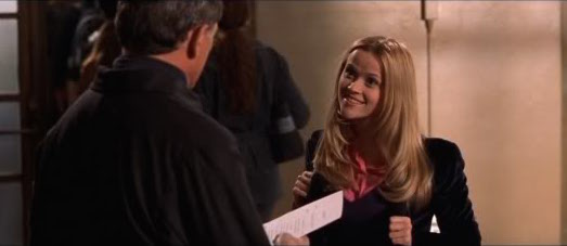
Elle from the move Legally Blonde hands someone her resume

Elle’s resume may have stood out from the crowd, but it can come off as unprofessional in the real world.

Even though the internship and job search has become increasingly digital, there are still scenarios where a physical copy of your resume is expected. Career fairs and interviews are two such times when a physical resume is necessary, and what is often overlooked is the very paper your resume is printed on. It is important to understand that the content of your resume is more important than the paper it is printed on. However, printing your resume on high-quality paper can make it stand out and is more durable than regular paper.

We’ll discuss below the different types of resume paper, but in case you are pressed for time here’s our verdict:

off-white, cotton, 32lb paper

Color


Off-White (Our Recommendation)

This is the safest choice in terms of resume color. While unique shades of grey, blue, and even pink will help you stand out, many employers see them as unprofessional.

Ivory

Many stores will offer ivory, but it appears yellow in natural light. We recommend viewing the resume in natural and artificial lighting because the paper can look different in natural light than it did in the artificial lighting of the store you bought it in.

Colored Paper

Some resume paper comes in a variety of different colors. However, they are controversial because many employers see them as unprofessional. In some cases, such as for design resumes, colored resume paper could work. Of all the colors, blue is the most neutral and safest.

Weight


A paper’s basis weight refers to how much 500 sheets of the uncut paper weighs. Heavier paper literally and figuratively carries more weight.

20lb Copy Paper

This is typical printer paper that many students print essays on. It will not make or break your resume, but it is flimsier and may be seen as less professional than a heavier paper.

32lb Resume Paper (Our Recommendation)

This paper is commonly used for brochures and flyers because of its durability. The ink is not visible from the other side and it does well in two-sided printing. However, for a resume we do not recommend that you print on both sides.

80lb Card Stock

This paper is thick and heavy, which makes it ideal for business cards. However, this level of thickness is not necessary for resumes.

Material/Texture


Depending on the finish and weave of the paper, different resume papers can have varying textures.

Cotton (Our Recommendation)

Resume paper infused with cotton lasts longer and makes the paper more durable. Use resume paper that has a smooth finish.

Linen

Linen refers to the woven-like texture that is applied to the paper by an embossing process. Some employers like this texture, but others see it as unnecessary and distracting on the resume.

Printing


It is easiest to print your resume at your own printer, so if you do not own a printer try to borrow a friend’s printer. There are many locations on campus with printers that do not use the net-print heading, such as the free Human Ecology printer in the Dean’s Lounge (MVR 159). However, in a public location it may be difficult to print your materials on your own paper and some printers may not allow you to change the paper manually.


Want more advice on your resume? Check out what fonts work best on a resume.

Preparing for an interview? Check out these blog posts!

Making your resume font-astic!

Font Examples

The process of drafting and editing your resume can be a difficult task. From selecting the perfect experiences to creating a balanced layout, making a resume is a representation of you have done and can even communicate a little bit of your style and personality.

(more…)

Big Red (and Blue)—Should I Include Politics on my Resume?


building during day
Photo credits to Joshua Sukoff

One of the most difficult processes in applying for jobs and internships is selecting which opportunities from your running resume to include. Even more difficult, some students face the challenge of whether or not to include political and religious activities. If you are one of these people, this post is for you!

USA Today’s Patrick O’Brien and Susan Davis-Ali, career experts, weighed in on this issue. They agreed that it isn’t a black and white answer—instead, it requires a certain amount of careful thought and consideration on your part. Here are some questions to help you weigh the pros and cons of including political and religious affiliations on your resume.

(more…)

Organizing Your Experiences: Resume Headers

woman signing on white printer paper beside woman about to touch the documents
Photo credits to Gabrielle Henderson

(more…)