The process of drafting and editing your resume can be a difficult task. From selecting the perfect experiences to creating a balanced layout, making a resume is a representation of you have done and can even communicate a little bit of your style and personality.
Something that is often overlooked is the font of the resume. The font can determine the overall look and feel of your resume. While it will likely not make or break your resume (unless you choose something unreadable or unprofessional), it can add an extra layer of thought and style to your resume. When choosing a font, also keep in mind font size. Many fonts decrease in legibility when they are smaller. Picking an overused font may communicate that you didn’t put thought into font selection and distract from the content of your resume. Other fonts may be difficult to read. For companies that scan resumes, it would be best to use a sans-serif font (fonts without small projecting features called serifs) to make your resume easily scanned. According to Business Insider, 90% of big companies use scanning software to narrow the resume pool and look for years of experience, keywords, and former employers.
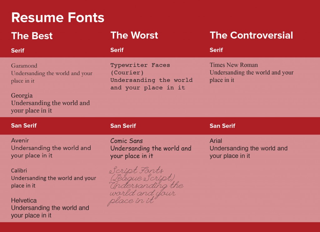
Here are our thoughts on some resume fonts:
The Best
San Serif
Calibri
This font is already installed on most computers. It reads well on both a screen and print.
Helvetica
This is a classic font. It has clean lines and is easily readable. It has been used in many corporate logos for this reason.
Avenir
This font has multiple weights and clean lines. This makes it a very versatile font that will fit in nicely with any part of your resume. Be careful of the Book and Light weights because in certain situations they can be hard to read.
Serif
Garamond
Garamond is a sleeker alternative to Times New Roman. It also takes up less room on your resume while still remaining legible.
Georgia
This traditional-looking font was designed to be read on screens, so it is compatible with many computers. It has a thicker stroke that makes it easier to read at a smaller size.
The Worst
San Serif
Comic Sans
This font looks very unprofessional. It was originally intended to mimic comic book text, so it is not appropriate for a resume.
Script Fonts
Script fonts are typefaces that look like handwriting or cursive. These are seen as unprofessional and can be very hard to read.
Serif
Typewriter Faces
These kinds of fonts are meant to replicate a typewriter, which is not what you used to write your resume
The Controversial
San Serif
Arial
While Arial is not a bad font choice in and of itself, it is often over-used. Many resumes are in Arial and using this font can make you blend into the crowd instead of standing out to recruiters.
Century Gothic
Century Gothic is a nice font, but may be difficult to read at small sizes. Use with caution.
Serif
Times New Roman
Like Arial, Times New Roman is not a bad font. However, it is not a font that will make you stand out and may show that you did not put thought into your font choice. The majority of resumes are written in Times New Roman.
To see more font families or explore more about typography, see these resources:
Link to Career Advice Article on The Proper Use of Fonts in the Resume

